
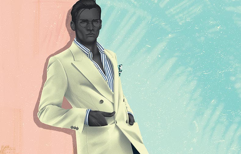
London illustrator Jack Hughes images are at once hyper real and magical. For the summer issue of 1972 magazine he illustrated the guide on how to wear the Café Cuba trend. They’re sharp and intense images, the pastel cast against the charcoal skin, while remaining cool and calm.
“I knew the mood had to be loosely 1950’s Cuban, I researched into the aesthetic and culture and tried to find relevant references of places and men that reflected that. I then tried to find and sketch out poses that echoed the effortlessly cool aesthetic but also showed off the clothes in the best way without it looking too clinical or reminiscent of something from a clothes catalogue,” says Hughes.
Jack’s first break came after he graduated from Kingston University in London when he illustrated his first book - The Gentleman’s Guide to Cocktails. It laid a platform for his reputation that got him work from Helsinki to Melbourne. Now his drawings have featured in Vogue, The Washington Post and The Village Voice.
Simon Day asked Jack about his inspiration and how travel influences his work.
What does illustration provide in an industry - fashion - where photography is such a prominent medium?
Illustration tends to be the alternative to photography and is rarely used as such. Not many brands use illustration which is a shame as it’s such a malleable format, it’s cheaper too!
When you're drawing for someone like Barkers, and you're portraying other people's designs, how do you stay true to the clothing at the same time as including your own influences and style?
What was helpful with this brief is I was given a moodboard that related to the collection, which helped inspire the feel and setting on the illustrations. Keeping the skin tones to a reduced grey hue and the details to a minimum helps the clothes stand out and become focal points of the illustration.
Your illustrations remind me of 1930s advertising/tourism aesthetic. What are your influences?
That was definitely an influence back when my style was in its infancy. The cocktail book I worked on shortly after graduating had a 1950’s theme to it so a lot of the references I drew were from mid-century advertisements.
I found your use of almost charcoal colouring of the models skin really fascinating. It's especially intense set against the pastel colours. What inspires that?
The charcoal skin colour originates from my earlier work back at university. I used to draw a lot of ominous silhouettes and graphic shapes in alien landscapes full of stars and pastel colours, that slowly transitioned into the style I use today, with only the colours staying the same.
Place seems to influence you work a lot and you’re often travelling. How does where you are influence your art?
Travel is a new obsession, I love visiting the States - specifically LA and NYC, Granada and Barcelona too - it helps having friends in the cities you like! In LA particularly, the light is gorgeous and the way of life is so different to that of London. Everything is so big and showy - the food, the people, the buildings, it’s inspiring in many ways. I also have an artist friend in Barcelona who I normally visit once a year, we work together on shoots and paintings where I’m the model but it’s a very collaborative process.
You've had the opportunity to work with some amazing brands, and designers like Montblanc and The Washington Post. Which is some of your favourite work?
I often forget what past work I’ve done, only a few projects stick out in my mind. One job in particular was with The Macallan, I created a series of illustrations for a social media campaign as well physical postcards. The theme was based around the golden age of travel in the 1920’s to coincide with a decanter designed by French glass designer Lalique.
You are able to impart a narrative into your characters, a hidden story, a history, to each of the images, which the audience gets to interpret subjectively. How do you find those stories?
I try to construct my illustrations, especially figurative ones, in a similar way to an editorial fashion shoot. I’ll sometimes include a small narrative but most of the time I leave it up to the viewer to decide themselves.
You have an ability to juxtapose intense detail, with really minimal simplicity. How do you know when to use detail, and when to leave negative space?
That’s one of the toughest challenges I face when working - knowing when to stop. What makes it even more difficult is when clients think parts are unfinished and get me to render everything to the same standard. It’s difficult getting clients to see your way of visualising something when they have their own idea of how something should look, leaving parts flat or minimal is sometimes a rebellious reaction to that.
When you're not drawing images for other brands, what are you drawing for your own catalogue?
I don’t find much time for personal work in-between commissioned work and when I do I normally want a break from drawing, which is bad and definitely something I’m looking to change. But when I do it’s normally Game of Thrones fan art! I have a load of self initiated projects up my sleeve but it’s difficult starting something you want to be good, I have a real fear of failing before I’ve even begun.
Check out Jack Hughes range of art here
Jack Hughes is represented by Maker's Mgmt